
Thailand's cosmetic market is growing year by year. Since Covid 19 occurred, people have tended to make purchases online, but for cosmetic products, people are unsure what would be perfect for their skin.
Beautology is the solution to problems simply and knowledgeably. Below are a few screen displays.
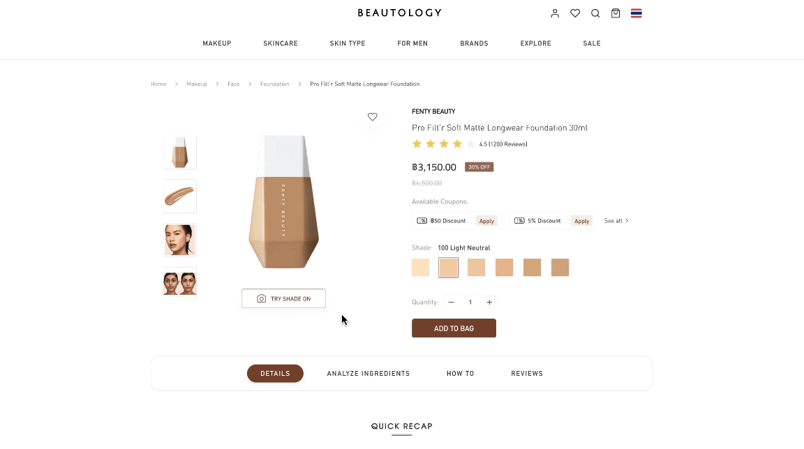
Provide a virtual try-on product to check that the item is fit for you.

Check if a product has any of the ingredients that skincare experts suggest avoiding.

Explore product tutorials, blogs, and reviews of each product.
The target user is people who watch beauty tutorials and buy a product at least once a month. I interviewed 5 people.
The interview script is available here.
From the interview, I noticed the reasons why customers decided not to buy the products online. For starters, each product has only a few reviews, or reviews are not all in one place. You must conduct your own research. Second, they are unsure whether the product will be suitable for their skin. Finally, the method of buying made shopping complicated.
After digging more, I revealed that people worried about a skincare product that would not fit their skin are likely to have skin issues.
According to the U.S. Dermatology Partners, Asian skin produces more oil due to the warmer climates of the regions. As a result, Asians are more vulnerable than others to acne outbreaks. Mintel studies show that while more customers desire skin products that deal with problem skin, they also demand assistance when selecting the proper skin care products.
For this project, I also considered various use contexts and the appropriate devices for each, which is why I ended up choosing a responsive website.
Discussion with the participants helped me in creating the following two personas.

.jpg)

%20(1).jpg)
Next, I give a story of how my personas were completing the tasks at the time.

After empathizing with the user, I define the user problem in order to examine the user's need that should be addressed.
%20(4).jpg)
%20(5).jpg)
My next step was to review some of the existing products and see what pain points they addressed. I chose four well-known cosmetic product websites. Click to see the analysis.
With the features and content in mind, I continued to design the website's structure.

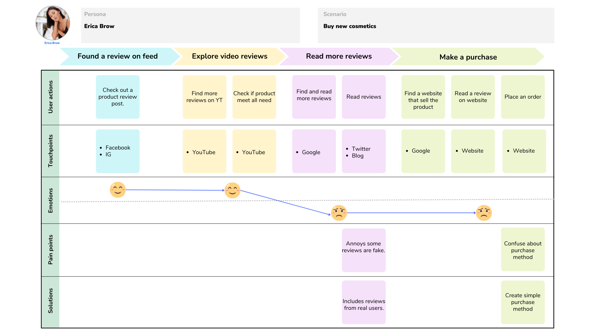
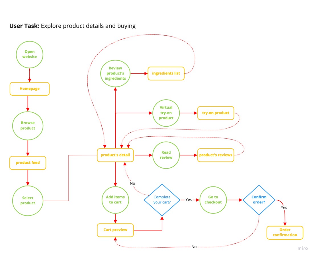
Then, I created user flows for the personas displayed in the image below.
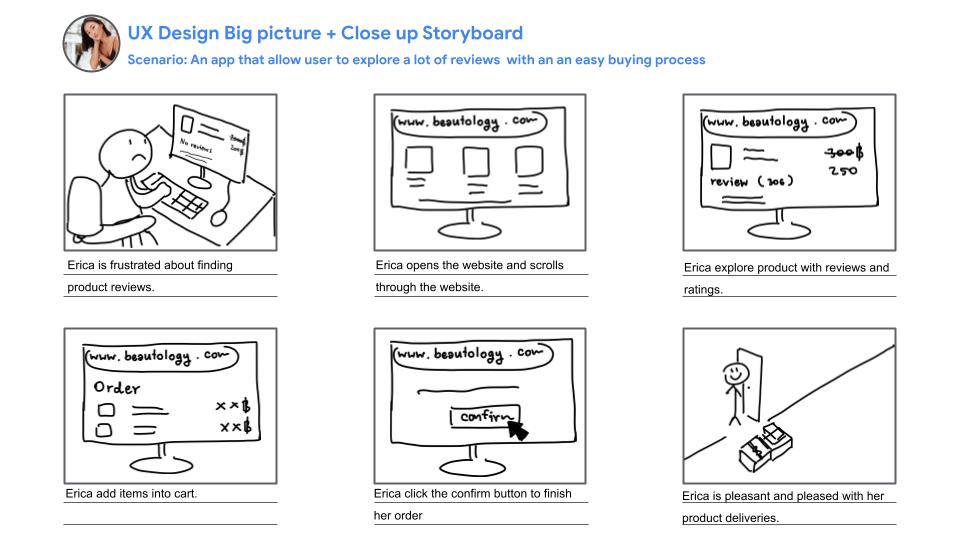
I proposed two storyboards for each persona.
.jpg)
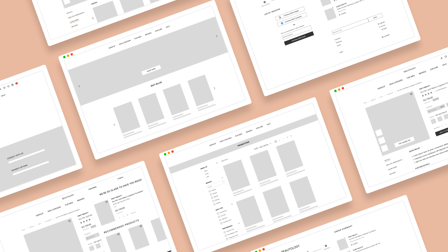
I started the design phase by drafting out low-fidelity concepts in Figma while considering the user tasks and pain points I had gathered so far.
After sitting and talking with the user, I realized that one feature from the initial prototype had gotten multiple complaints after completing usability testing. The most frequent task in which participants expressed frustration about what it represented is ingredient product analysis.
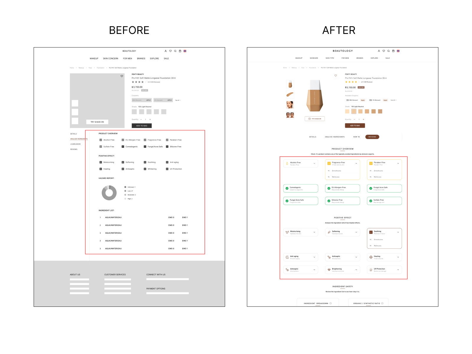
I originally did not provide the specifics of what it meant. A participant said to me that they didn't fully understand how it worked or what it meant. To make it easier to grasp, I've detailed each function.
When designing a high-fidelity interface, I concentrated on the aesthetic look and covered feedback from usability testing.

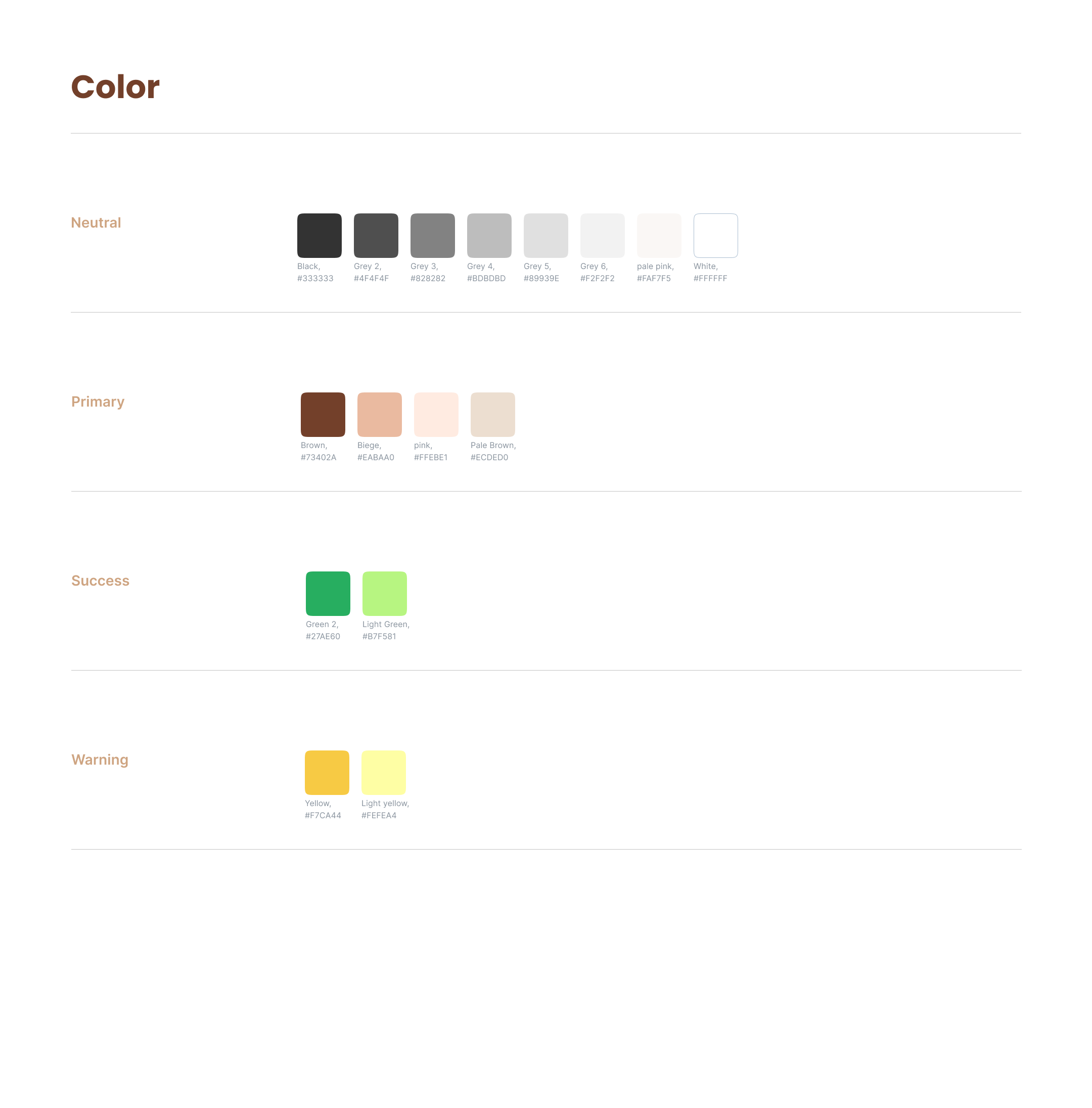
Beautology should make us feel attractive, clean, scientific, and trustworthy, and I thought as I designed the app's visual aesthetic. I prefer the color brown, which symbolizes reliability and integrity. The color brown is highly valued. Brown is an excellent counselor and an even better friend because of these amazing characteristics. Brown, on the other hand, gives us a dull and boring sense. So I decided to mix it with a tint of accent color to make it more inviting and appealing.
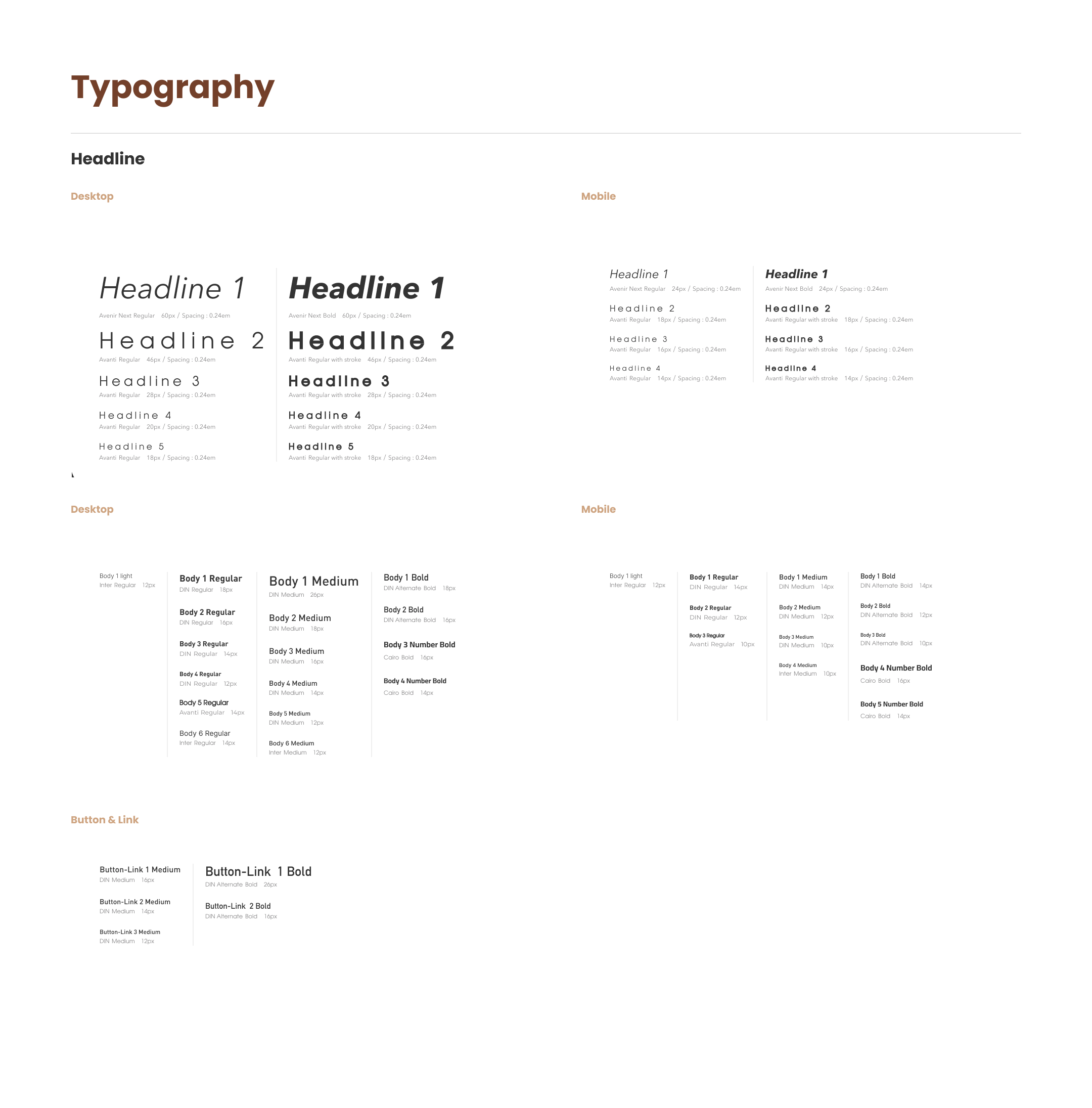
For the header, I used the Avenir Next san serif typeface, which has a clean and simple tone. Avanti San Serif is another typeface. Avanti's supreme geometric gives me a sense of science with a bit of quirky and unique style. I used DIN san serif typeface for the body because it has a technical and clean tone.
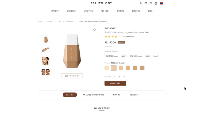
A visually appealing and engaging landing page to engage users and make a positive influence on the website.

All reviews are in one place, including blogs, videos, and user reviews to help users make sure the product is reliable and also good quality.
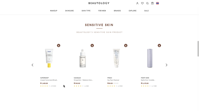
Check the sensitive skin symbol and the ingredient checker analysis to assist users that the product is suitable for their issue skin.
A virtual try-on allows users to try on products with the shade that match their skin without having to go to a store.
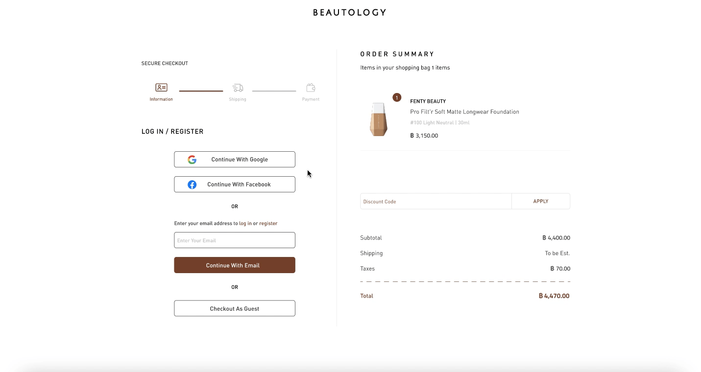
The simple checkout process is broken down a difficult task into tiny steps and informs the user of the information that needs to be filled out.
This project taught me the importance of paying attention to different contexts and user conditions. One user may have hugely different demands than another user for a number of reasons, and one user may have just simple needs.