After studying at university, it is always a disaster when it comes to lunchtime. The cafeteria is packed with students taking the same lunch breaks. It is even worse when you have to randomly check to see if it is your order or not, and even more when you get the wrong food order after a long wait. Or, in other cases, you must wait in line until your order.
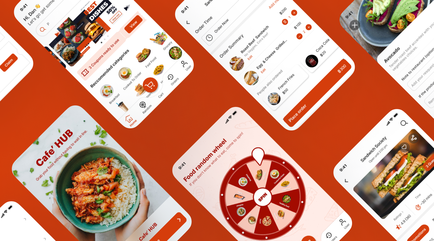
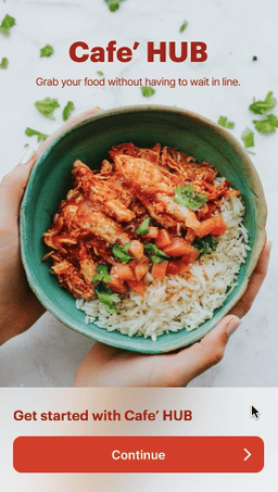
Cafe' HUB overcomes this issue in a fun and simple way. Here are some examples of screens.
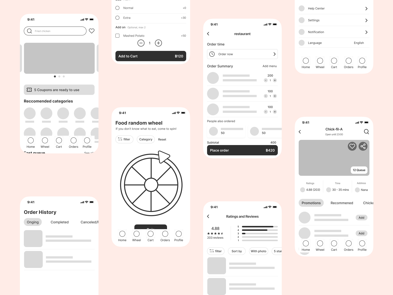
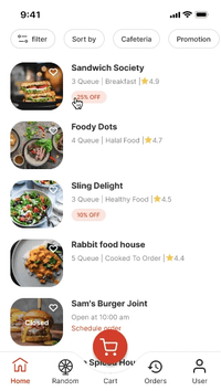
Explore fast queue section along with a number of queues.
Place parallel orders ahead of time.
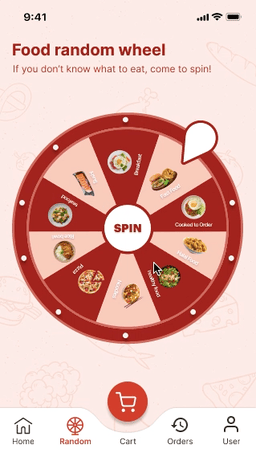
A food random wheel is applied to engage users in making a choice.
Regardless of the fact that food ordering app is very popular nowadays and I am the one who is facing this issue, the core of the challenge was "increase efficiency ordering food in advance for faculty" which was filled by various tasks. I did not want to jump right into ideating concepts based on assumptions right away. Instead, I wanted to discover as much as I could about the academic staff experience.
A target user is considered to be university faculty. I decided to interview 5 people in my network.
While writing the script, I kept the questions open-ended for the participant to elaborate on their meal-ordering experience. It was crucial for me to reduce bias and be non - judgmental during this process.
Following the interview, I discovered that the cafeteria is packed with students who take the same lunch breaks, which involves the greatest pain points while placing an order. Because ordering food at the cafeteria needs you to jot down your order and then completely random check to see if it is your order or not, and sometimes you receive someone else's meal or the wrong food. Or, in other cases, you must wait in line until your order.
In this study, two additional aspects were explored: lunch break time constraints and a lack of ideas about what to eat.
Students sometimes take a 1-1.30 hour lunch break. There are just a few food restaurant options in the canteen.
Finally, I focused my scope to mobile applications since when the faculty placed an order, the participants did not have a computer with them. As a result, using mobile would be more convenient.
Communication with the participants provided me to create an empathy map and the persona below.

%20(1).jpg)
Next, I give a story of how my personas were completing the tasks at the time.
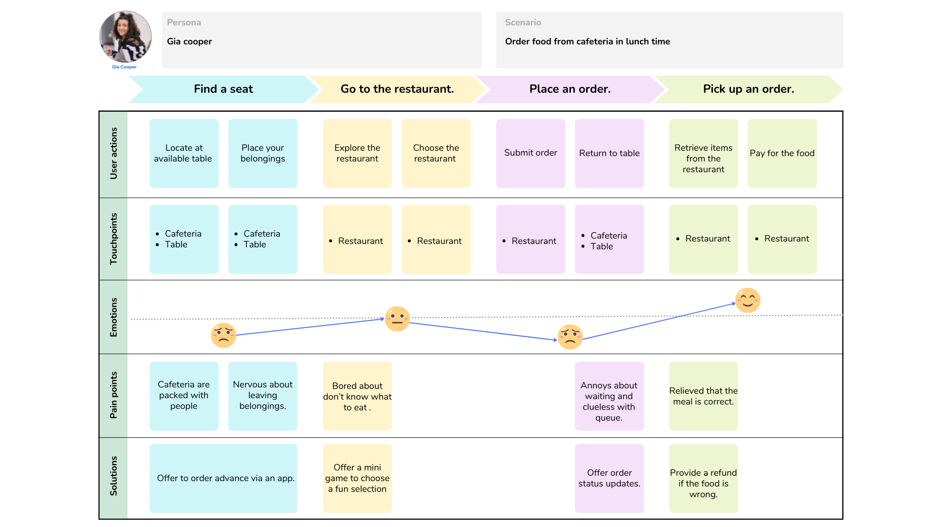
After empathizing with the user, I define the user problem in order to examine the user's need that should be addressed.
.jpg)
Now that I have identified the user's emotions as they performed the tasks, I can explore some existing solutions to see how they coped with the challenges. I selected three popular food delivery apps from the app store and play store. Click to see the analysis.
With the features and content in mind, I continued to design the website's structure.

Then, I created user flows for the persona displayed in the images below.

I proposed a close-up storyboard, following image below.
.jpg)
I started the design phase by drafting out low-fidelity concepts in Figma while considering the user tasks and pain points I had gathered so far.
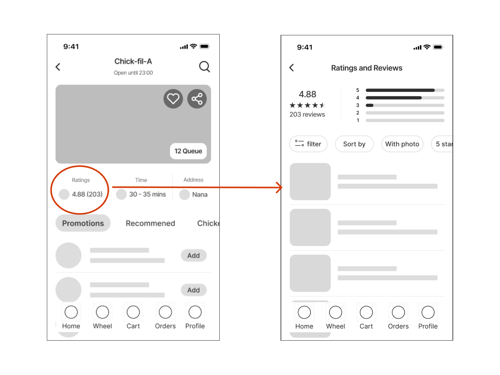
After conducting unmoderated usability testing, I discovered that one aspect of the initial prototype had received several complaints. Finding ratings and reviews for each restaurant is one of the most often performed activities. Participants mentioned how confusing it is to notice the logos and were unsure they could click for further information.

When designing a high-fidelity interface, I concentrated on the aesthetic look and covered feedback from usability testing.
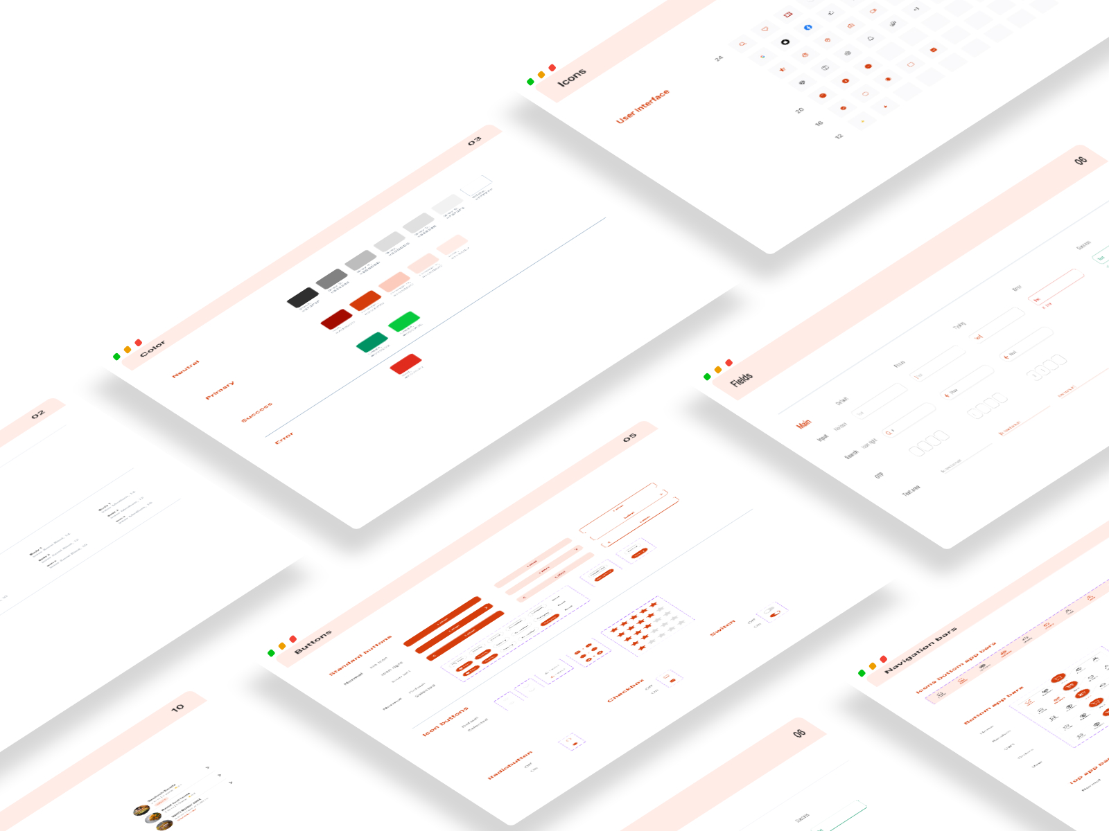
When designing the app's visual style, I kept in mind that Cafe' HUB should be welcoming, simple, and easy to use.
I chose orange and red colors and designs. The orange hue is considered a fun color that gives us a young and enthusiastic sensation, while the red color gives us energy and a powerful sense that encourages users to take action. Also, ensure that it meets color contrast accessibility.
For the header, I used the Graphik san serif typeface, which gave it a friendly and uncomplicated tone. I used Inter san serif typeface for the body as it has a long x-height that helps with readability of mixed-case and lower-case content.
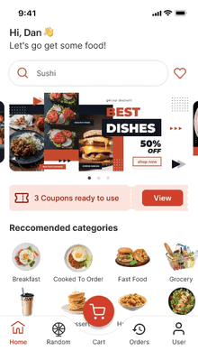
User can log in via KMITL login or other options.
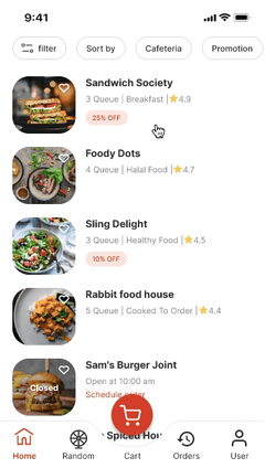
User can go through the fast queue section, filter cafeterias in KMITL, and see the number of queues to know what queue is going on.
A food random wheel is designed to help users who are bored with a few restaurants choose a fun selection.
User can view each restaurant's info, review, and then place the order in advance while receiving status updates.
Place parallel orders ahead of time to save users time waiting for meals.
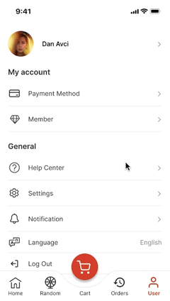
Offer a member card and coupon discounts to increase sales.
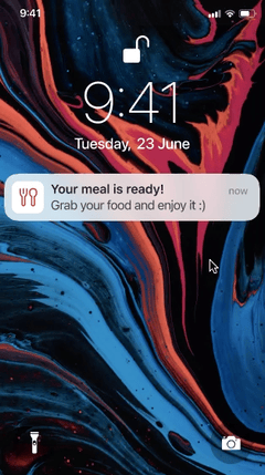
When it is their queue, the user will receive a notification to help them stay on track and avoid losing their queue.
One thing I learned from this project is the significance of considering the user-centered. I need to keep keep the user in mind throughout the process. Otherwise, I wouldn't be able to identify other users' needs with neutrality. Despite the fact, I am the one who is facing this problem. But I do not want to create an app that exclusively solves my problem. I would like to look at the issue reflectively and address the difficulty that people are facing.